Blog Post 10:
Textile Design – Patterns:
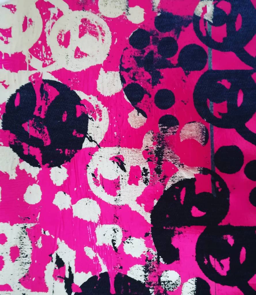
Since 1875, Liberty is renowned for being at the cutting edge of fabric design. Liberty impacted British textile design through Orientalism, Art Nouveau and Art Deco in the early 20th century. Then, there has been a revival of these styles since the 1950s. Liberty Art Fabrics is an internationally recognised leader in floral, paisley and patterned prints. Liberty has had strong relationships with designers since 1875, such as Arthur Silver of Silver Studio, Jean Muir, Cacharel, Yves Saint Laurent and Vivienne Westwood. Friends of mine have looked at my fabric designs and have strongly recommended that I contact Liberty to share my work with them to get some feedback, to make contacts and to maybe work for them too. Recently, I visited the store in London to browse around and get a feel for the fabric designs which it became famous for. Contacting personnel, in the brand, is something I will most certainly do in the new year. The thought of sharing my work with them fills me with pleasure and excites me. Below are some images of my latest digital prints, which I created as part of my Biomimicry assignment.


Zandra Rhodes (born 1940), also internationally renowned for her fabric designs, was introduced to the world of fashion by her mother, a fitter for a Paris fashion House. Zandra studied at Medway College of Art, and then at The Royal College of Art in London. Her main area of study was printed textile design. Her early textile designs were considered too outrageous by the traditional British manufacturers. So, she decided to make dresses from her own fabrics to promote them instead. In 1969, she took her collection to New York where Diana Vreeland featured her garments in American Vogue, after which she started selling to Henri Bendel in NY, Sakowitz, Neiman Marcus and Saks. In the UK, Zandra was given her own area in Fortnum and Mason, London. As Breward C. has stated (1995) in ‘The Culture of Fashion,’ Zandra’s ‘screen printed silk chiffon evening dresses of the early seventies incorporate ethnic, oriental and Gipsy motifs in a high fashion appropriation of counter-culture and anti-commercialism’. Her use of bold prints, feminine patterns and theatrical use of colour has given her garments a timeless quality. In 1977 she led the pink and black jersey collection with holes and beaded safety pins.

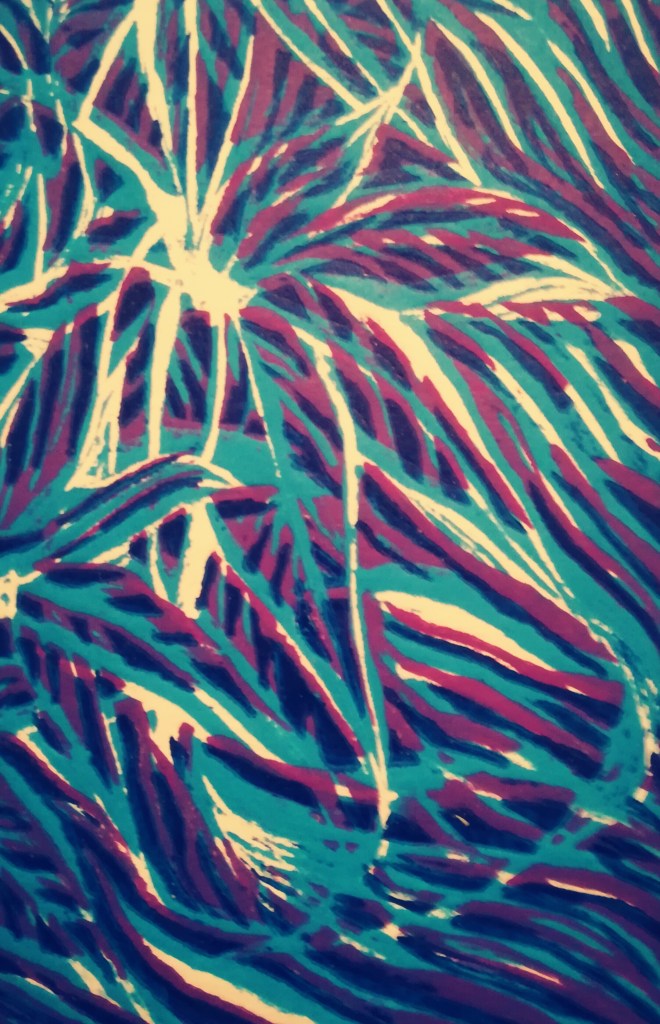
It is popular now for designers to create fabrics which look distressed and authentic. This is on trend, especially for denim. Many modern-day garments are faded, frayed or ripped. The authentic look , when I have created prints, can also have historical links. I enjoyed exploring this style within my own printing of fabrics when using the heat press and collagraph. Also, when I was researching the 1980s fashion, Madonna was a real trend setter because she was wearing ripped jeans when not many people would have done so then. So, she was in fact way before her time. I bet not even she guessed that the ripped jean effect would still be popular 40 years later. Below are examples of distressed looking prints (leaf themed) which I have created for an off the shoulder top and three quarter length wide legged trousers.

During the past couple of years, I have loved creating many handcrafted prints. This year, I have enjoyed creating digital onto fabrics too. Collagraph is a printmaking process in which I applied materials to mount card, as well as carving lines into the card too. The word is derived from the Greek word koll or kolla, meaning glue, and graph, meaning the activity of drawing. I used a variety of materials in creating my highly textured collagraph plate and included extra patterns in comparison to the original second design. I applied material netting to represent barbed wire. Ink was applied to the resulting collage and the board was used to print onto paper and satin material.


The heat press was a wonderful experience for me. I was so excited when I first started creating materials with my designs on them. First, I photocopied my design to make the density of my original pencil drawing darker. Then, I used a combination of different coloured inks and covered A3 pieces of paper. Then, I placed the photocopied design face to face with the dried coloured ink paper and placed it in the hot press for 60 seconds. After that, the photocopied design had a coloured background. At this point, I placed the coloured design face to face with material and once again put them in the heat press for 60 seconds. I then went onto see what would happen if I left the material in the heat press for 120 seconds instead. At this point, I discovered that the print came out much stronger when left in for 120 seconds. I enjoyed experimenting with all of the different effects I could get, by just using one design or one repeat pattern but varying the colours used. I also experimented by using different types of fabric too: silk, chiffon, denim etc. I loved my outcomes produced from this technique.


I enjoyed using the lino printmaking technique, in which a sheet of lino was used for a relief surface. I found an image of a leaf and used this as inspiration for creating a linocut image. I cut a first layer into the lino surface with a sharp knife. The lino was then inked with a roller, and then rolled through the printing press onto paper and fabric. I repeated this process another 2 times afterwards, cutting into more of the lino each time. The first ink I used was light blue, then purple and finally navy. The principle was that each layer of colour needed to become darker. I loved the final effect and personally thought this would be a really fun and modern design for a jumpsuit or summer shorts, especially after looking at current leaf patterned trends on fabrics in stores and online.
I also used the method of drypoint, which is another printmaking technique, in which an image is scratched into a clear, plastic plate with a hard-pointed, sharp metal instrument. It is actually a similar method to engraving metal. After I scratched my design into the plastic plate, I put it through press along with ink. Some of the areas of the plate had fine layers of ink smudged onto it to create an element of shading. Once it had been rolled through the press, the ink from the scratched areas transferred to my paper samples. I experimented with different colours and I personally liked the red effect more than the violet colour. This was a very time-consuming method of creating a print but the look is very delicate and effective, in my opinion.
Melanie Bowles, who has been a Senior Lecturer in Digital Textiles at Chelsea College of Art & Design, has discussed in ‘Digital Textile Design’ (2009) another lecturer in Textile Environment Design (TED) in much detail. She reflects upon the work of ‘Rebecca Earley……an award winning fashion textile designer who produces textiles for her own label B. Earley’. Melanie states that ‘Rebecca Earley’s collections demonstrate how the designer can work fluently with digital technology and handcrafted techniques.’ I was particularly intrigued by the fact that Rebecca has created handcrafted prints and then converted them into digital prints. This is most definitely something I intend to do in my work. I have in the past couple of years had much experience in creating hand crafted prints and now is the time, as I have access to the facilities at university, to develop the designs digitally and then digitally print them to see alternative effects. It’s also much more practical to digitally manipulated fabrics rather than handcrafted fabrics which are more delicate. Washing digitally printed fabrics is easy and practical, whilst hand crafted techniques do require handwashing ideally, which is rather time consuming with our busy lives which we lead in the 21st Century.
So, I conclude that I very much enjoy creating prints through handcrafted methods but also very recently I have loved the outcomes of digital printing, which I have produced. Zandra Rhodes will continue to forever inspire me and Liberty is where I will be making connections with very soon for future work opportunities. I enjoyed my visit there and feel I have the capacity to design fabric prints for them.
References:
Bowles M. (2009), ‘Digital Textile Design’, Laurence King Pub. (P.164 – P.165)
Breward C. (1995) ‘The Culture of Fashion’, Manchester Uni. Press Pub. (P.232)
